Twenty Fourteen is WordPress’ shiny new default theme, released Thursday alongside WordPress 3.8. I worked with the Twenty Fourteen development team throughout the cycle, doing everything from proposing features to removing features to proposing design tweaks, fixing bugs, and testing the theme everywhere.
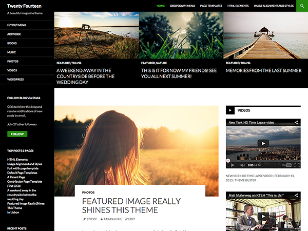
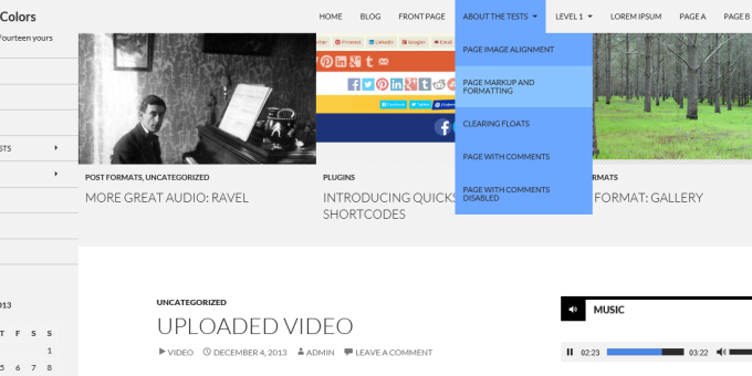
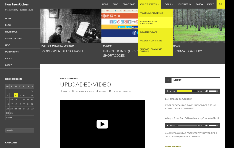
Twenty Fourteen features black, white, and green as its primary colors. In September, I introduced an “Accent Color” feature that allowed users to change the green color to any color of their choosing. With a lot of help from the rest of the Twenty Fourteen development team, the feature made it into the theme and was improved through the duration of the development cycle.
But just over a week before the theme was set to debut to millions of self-hosted WordPress users–and after the theme had debuted on WordPress.com–the accent color feature was removed.
There are several reasons for the feature’s removal. For one, it was possible to pick any color, which meant that users could select low-contrast colors rendering portions of their site unusable. Additionally, two alternate shades of the user’s choice of color were generated behind the scenes, meaning that the feature was code-heavy. The default WordPress themes seek to be as code-simple as possible, to aid beginning developers and to make the default themes good candidates for use as starter or parent themes.
Because of the short development cycle for WordPress 3.8 (the cycle actually overlapped 3.7, but there was very little time devoted exclusively to 3.8 after 3.7 came out), it was clear that there wasn’t time to develop an alternative or improved accent color implementation in the theme, and the feature was removed.
However, I moved the feature to a plugin while it was removed from the core theme. I also added a new “Contrast Color” option. Over the past week, I’ve built out this new plugin, entitled Fourteen Colors, and I pushed a polished version 1.0 just as WordPress 3.8 was released.
In just a couple of days, the response to Fourteen Colors has been amazing. I knew that it was well-done both inside the code and to the end user, but I never expected such a positive response from developers and casual users alike. Check it out now, review it, spread the word. And let me know if you find any bugs, maybe-bugs, ideas for enhancements, or anything else. Fourteen Colors is off to a great start, and I’d like to keep the momentum going! One of the most significant things that helping develop Twenty Fourteen taught me is the power of the community: the more we collaborate and help each other towards common goals, the more successful we are in our individual pursuits are as well.
Love this Plugin ! Thanks 🙂
Thanks!!! I was just wondering how to fix this in my css…..
This is really great!! Thank you so much. I am learning wordpress for the first time and your plugin alone has given me so much of the freedom that I was hoping to have. There is only ONE field that I haven’t been able to modify the color of, and that is the main box in the middle of the screen where all the posts appear. In your many colored examples of how your plugin can be applied, it is the area which “Uploaded Video” and the embedded video box is. Is there anyway to change this to something other than white so that the WHOLE website has one background?
Thanks again for your awesome work! You’re the best.
line 822 in style.css file…
Yeah, this requires a fair amount of custom CSS and is outside the scope of the plugin. It can be done but if you’re looking to change that you’ll start to run into some more fundamental design decisions within the theme.
Hi Nick. This plugin is really helpful. But i still have a problem…
Automatically this plugin changes the font color to make better contrast. My site is “green-based” and fonts automatically turns on black. How can i do to have white fonts in all the header and navigations sidebar?
Take a look at the CSS in color-patterns.php, specifically around line 60, and add it to some custom CSS or a child theme. Just note that the black is only used if white results in insufficient color contrast for accessibility (4.5:1 ratio), so by switching to white you would make your site less accessible.