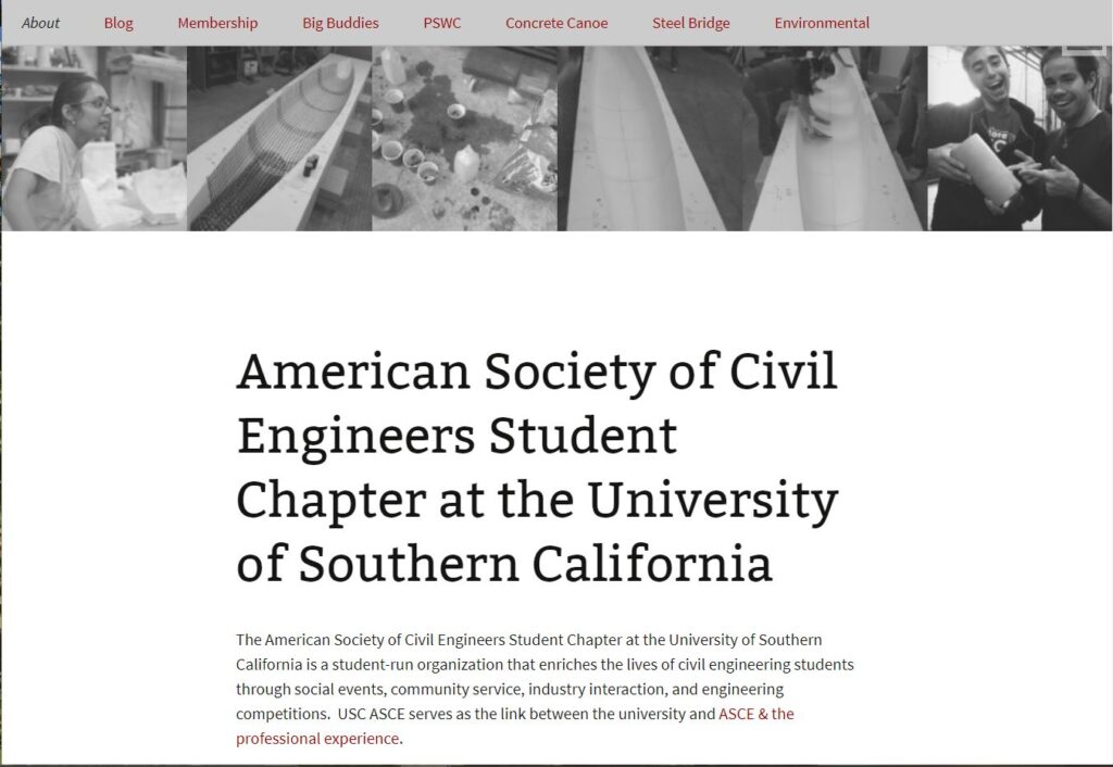
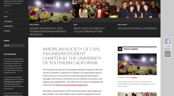
We’ve launched a visual redesign of our website, addressing several concerns about our site’s usability that came up in our Fall 2013 survey.
Previously, we used a custom child theme of the Twenty Thirteen WordPress theme. Now, we’re using Twenty Fourteen, with the Fourteen Colors plugin.
The new design features images more prominently and boldly (see the design team pages, for example, Concrete Canoe). It’s higher contrast and more readable. And most importantly, it provides several tools for us to highlight the most important content, for example, through the new sidebar on the left of the screen.
Continuing our commitment to open source software, I contributed heavily to the development of Twenty Fourteen, so that we could make it better for both our uses at USC ASCE, and for thousands of other sites worldwide.
We hope you like our new design!
Previously:


