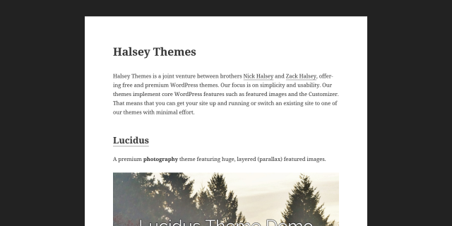
Twenty Fifteen is another great default theme that can be easily customized. I recently had to put up a quick site for my new themes site on halsey.co. I only wanted one or two pages, with a super simple layout.
I decided to just remove the sidebar (remove the widgets first) and center the content area. On mobile, all we need to do is remove the header. This also removes the “proudly powered by WordPress” footer, as there’re better ways to display that in this context if you want it. Here’s the CSS:
body:before,
#sidebar,
#colophon,
.entry-footer {
	display:none;
}

.site-content {
	margin: 0 auto;
	float: none;
	width: 100%;
	max-width: 1200px;
}
If you’re not familiar with CSS, the easiest way to implement this is to install & activate the Modular Custom CSS plugin, then go to the Customizer and add the above CSS to the “Custom Theme CSS” field.

thanks for your good posting
can i ask you one more?
i could do this by your advice
but i want to display my footer
CSS code that you offer remove footer.
is it possible?
Yes, just remove the .entry-footer part (as well as the preceding comma).
Thank you. Your help
Not working 🙁
Footer part will remove from footer.php file
This is a cool edit, but when if you want a legit header? How can You have a header on the the top?
Thanks for posting! I’m currently using the twenty-fifteen theme. Ultimately, I’m wanting my site to format exactly how it appears on mobile and tablets. Does that make sense and is it possibly? Thanks again!
Thank you so much for this.
Saved me a lot of time.
Good work!
Thanks a lot for this.
Saved me a lot of time.
Appreciate it.
I love this. I still have the left area with the Site Title. Is there any way to get a “Mobile Menu” for all sizes?
Seeing your work here, I Googled “Lucidus” and loved it. (I used to love south of Portland and enjoyed your video.)
Then put your demo theme to the test:
https://developers.google.com/speed/pagespeed/insights/?url=http%3A%2F%2Flucidusdemo.halsey.co%2F&tab=mobile
Very disappointed you are in the “red zone”.
Helped me develop my theme prototype! Thanks man.
I was wondering how to center the site name? Great help and all the best playing music!
Thank you <3<3
You just saved me like an hour of figuring out child themes again. Thank you.
Any way to keep the mobile menu?
wow! thanks for the post. Now i’ve found ways to customize my Twenty Fifteen theme used on my blog right now.
thanks a lot!!
Thank you so much! We’re using this on our next build! 🙂
Thank you for the snippet, btw your website background is creative and weird too .. awesome experience here !!
Thank you, it works!
Works like magic! Many thanks.
Wow! I never heard about it! Thanks for sharing!
Not working 🙁
How to completely remove it not hide 🙁
Thank you so much, you are a life saver 🙂