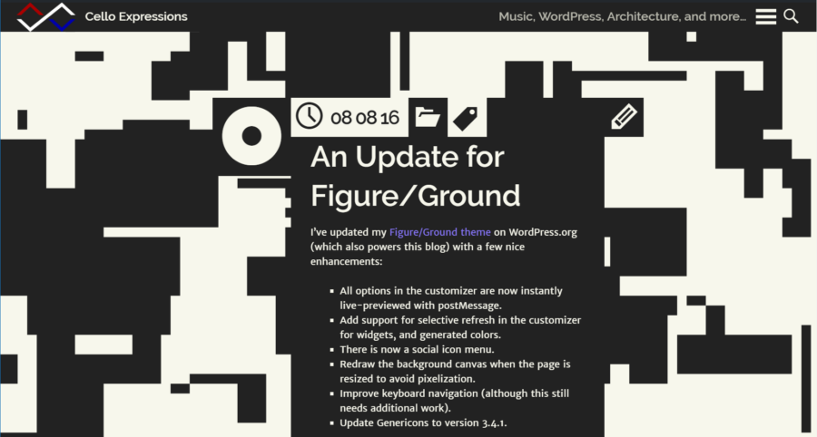
Five-plus years after its launch as a bold new typology for WordPress themes, Figure/Ground has been updated to version 2.0. This modern reincarnation maintains the bold design language while taking its functionality to the next level. Accessibility-ready support and full compatibility with the WordPress 5.0 block editor “Gutenberg” are the most notable upgrades.
Figure/Ground runs this site, as well as the Cello Expressions index. While I have already designed (but not built) the next theme for this site, with these updates, I plan to keep Figure/Ground around for a few more years.
Modernization
Figure/Ground began as a visual experiment. Its conscious use of only two high-contrast colors places a large emphasis on the animated background graphic. And using a randomly-generated background graphic, technical parameters define the levels of complexity in the visual experience.
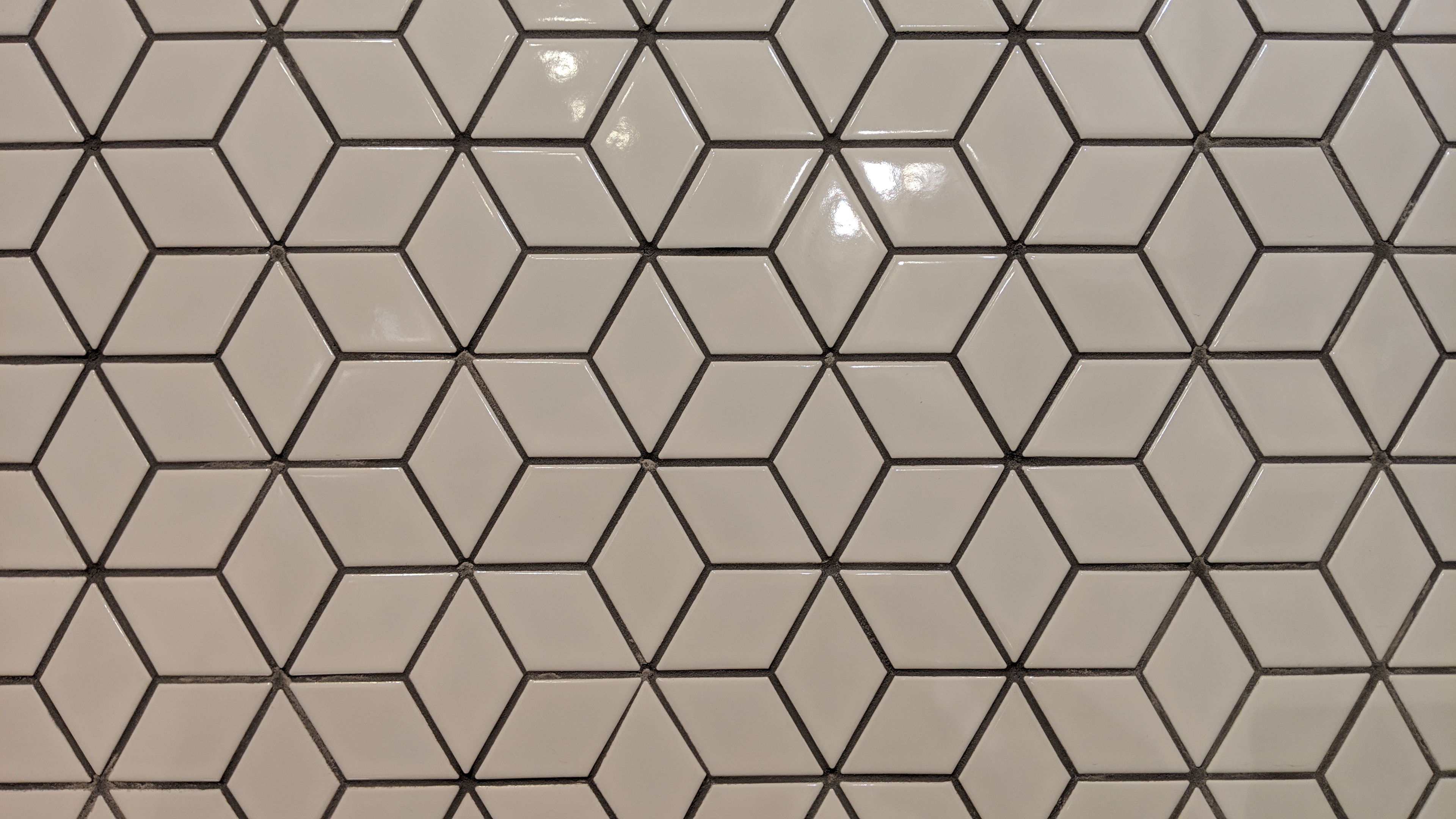
After five years of an “orthogonal” graphic that is organized to 16-pixel intervals, Figure/Ground was ready for a more-unified default experience. The new “rhombus” mode regularizes the solid/void background relationship. Regions of randomly dark or light background fall into a grid of rhombuses inspired by a wall tile pattern. This new option also chamfers corners on post and widget containers, similar to the existing “circular” mode.
Accessibility
The unification with the rhombus pattern also moves away from the emphasis on animation. This creates an opportunity to turn the animation off by default for improved accessibility.
Figure/Ground is accessibility-ready as of version 2.1. I have become more concerned with the critical importance of accessibility in digital work since I first released Figure/Ground. And I was aware of so many fundamental accessibility problems in this theme that I did not think that meeting the WordPress.org accessibility-ready requirements would be possible.
But the adjustments required were relatively manageable. In addition to turning off the background animation by default, I added a button for users to turn the animation off on the front end, inspired by the WordPress header video feature. I also improved the buttons that toggle post meta information, fixed keyboard navigation, redesigned link styles, and added screen-reader text.
With the accessibility improvements come inherent improvements to search engine optimization and flexibility to accommodate future input modes. I plan to place greater emphasis on the accessibility of my own content and of my WordPress themes and plugins moving forward. Optimizing for web standards, machine-readable contents, and accessibility and SEO is the first of my seven keys to sustainable WordPress projects.
Blocks, Embeds, and the New Editor
WordPress 5.0 introduced the new block-based “Gutenberg” editor. WordPress core has not worked through good processes for themes to support block-based content in a portable way. However, there are a few API options that allow themes to integrate the block paradigm during the transition.
Figure/Ground 2.0 adds support for core editor blocks, typically applying the theme’s existing styling to the new block-oriented elements. Is extends the customizer color options to the editor, bringing users’ customized options into the text and background color palettes. And it enables the wide and full-width block alignments that the core editor now supports. Building on the theme’s notion that only photos break out of the strict bi-chromatic canvas, photos can now consume the entire screen within the context of a post thanks to wide and full alignments.
I also added custom styling for WordPress embeds. Following the belief that in-site embeds should be unified with the site design, and external embeds should reflect the host site’s aesthetic, embeds now use the colors of the theme (as customized). The theme also refines the core spacing styles for improved consistency. See the end of this post for an example.
The Case for Artistic Themes
Little has fundamentally changed in website design since the original release of Figure/Ground in 2014. Many websites are designed to look good and function well, but few make bold or artistic statements. As WordPress seeks to democratize publishing, my goal with Figure/Ground is to make it easier for site owners to present their content in unique and inventive ways. Accordingly, Figure/Ground is highly-customizable; no two sites with the theme need to look alike.
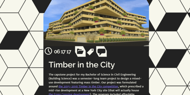
I hope to create more themes like Figure/Ground in the future. Linework is my second-best example of an artistically-driven theme so far. My other current themes are somewhat more traditional, although each seeks to present content in an unconventional way. Lucidus is entirely image-driven and Visualize is hyper-focused on the simultaneous presentation of an image with text. Each of these themes needs an update similar to Figure/Ground, particularly to be fully accessible and support the block-based editor.
My themes are a strong counter to the notion that WordPress themes could be replaced entirely with block templates and style skins. Themes’ roles for WordPress sites need technical simplification. And countless existing themes should be consolidated into an experience that is almost-entirely driven by WordPress core. Generic themes should only have a small role. But as this consolidation happens, I anticipate an increased desire for highly-opinionated and artistic themes.
The importance of a unified, carefully-crafted design language cannot be understated. My conception of themes takes this further to emphasize unique design languages with a highly-creative and artistic flair. Beyond the content “chrome,” I envision each theme as an inspiration for the content that it will present. Fonts, colors, and page templates are a good start; however, they may limit the creativity that themes, and by extension sites, could present. I foresee specialized themes and an increased emphasis on custom post (content) types as the exception to reduced roles for themes on a WordPress site.
Beginnings
Figure/Ground was originally inspired by a project in my second-year architecture studio at USC. The relationship between solid and void forms and spaces is critical to architecture and similarly applies to any creative medium. The digital derivation of this study is manifested in a constant dynamic sequence of change. In response to the increasingly-banal presentation of digital content, Figure/Ground transforms blogs into disruptively flat, high-contrast, animated explosions of text, icons, and artistic forms. My initial announcement of the theme still includes the raw, unpolished concept:
WordPress itself has changed substantially since Figure/Ground was first created. The post above references a project to improve the theme-browsing process withing WordPress–since then, that project has aged and I led efforts to bring a live-preview-oriented theme browser into WordPress. While the implementation of Figure/Ground has also aged, its fundamental objects remain valid. This update breaths new life into the theme and allows it to once again represent my full creative abilities in website design.