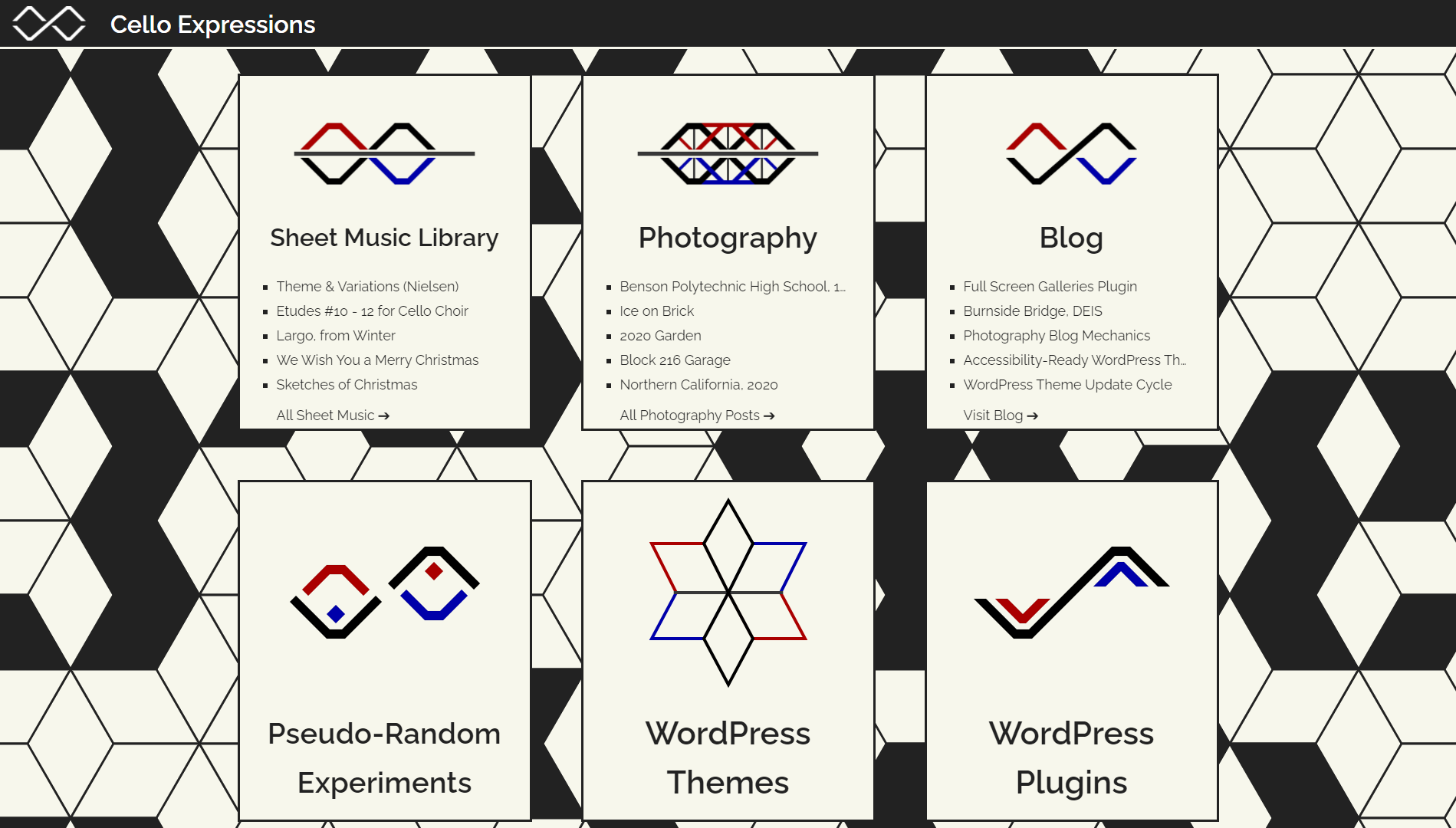
The cello expressions logo originated in 2013 as a simple sketch drawn during a music history class. An angled arrangement of seven line segments forms an abstract shape. And that abstraction conveniently represents several of the Cello Expressions projects.
I reworked the logo’s digital interpretation about six months ago. Last week, I decided to build out a full library of project-specific logos during a productive walk. I took the opportunity to redesign the Cello Expressions index page to present a unified design concept and introduce each project visually with its custom logo.
I also completed a long-planned project to restructure the “global” cello expressions header bar. A toggle menu replaced the persistent full-width bar. The resulting design adapts better to the unique designs of each project site. It’s also more accessible, responds better to various screen sizes, and removes technical dependencies like the Dashicons and Genericons icon fonts.
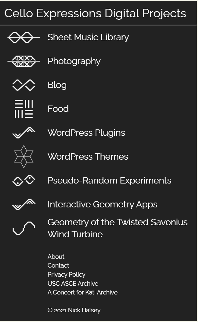
Each project uses a custom-designed logo with the new designs. The HTML alt attributes used for these new logos reveal the intended meanings behind each variation for the first time. Most of the variations build on the fully-abstracted base logo. Then the last few diverge within a similar aesthetic. The following chart describes the intent of each image: