I’ve just launched a new theme here on the root portion of Cello Expressions (containing the about & contact pages & the blog): Figure/Ground.
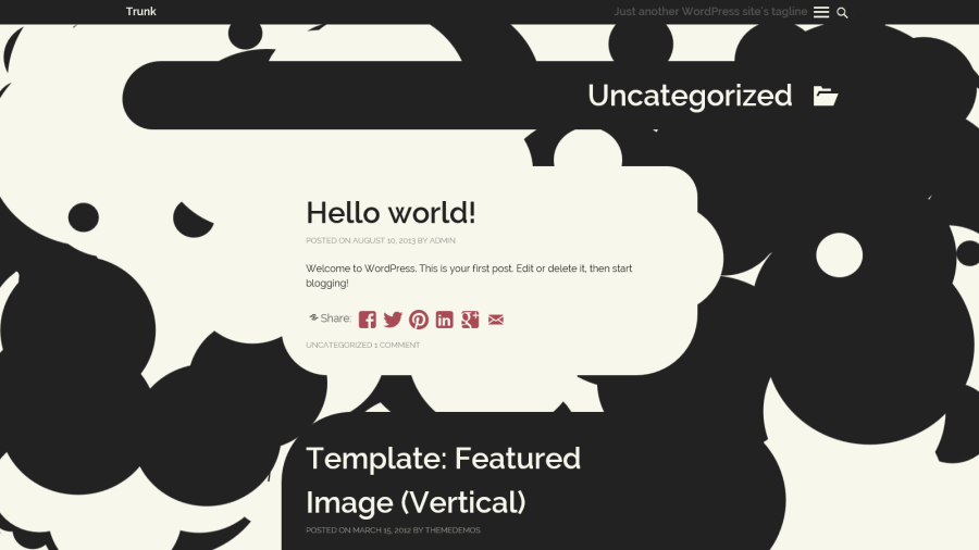
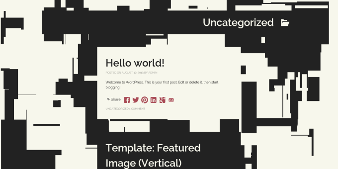
Figure/Ground is completely different from any WordPress theme (or website, for that matter) I’ve ever seen. The site’s design is alive and quite literally evolving before your eyes, as geometric patterns emerge and disappear in the page background.

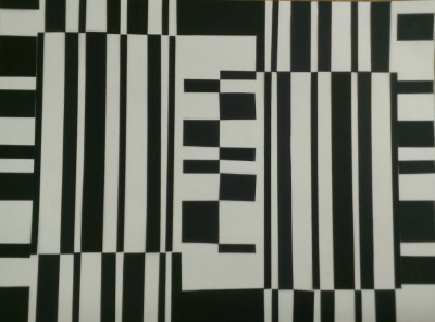
Artists will quickly realize the Figure/Ground is a play on the concept of figure/ground, where one color represents a figure and another represents the background. Figure/ground exercises are common for architecture students because they aid in the exploration of the ideas of solid and void.
The Figure/Ground theme takes the concept of figure/ground to another level, leveraging the digital medium to create a dynamic animation that constantly creates and destroys space. The figures are drawn and removed at randomly-generated positions in randomly-generated sizes at a fixed interval. When the page initially loads, a few hundred iterations of this process are instantly run, creating the initial figure/ground canvas. As a result, the background never repeats its patterns and starts from a different configuration on every page load. The constant motion, as well as the constant creation and destruction, create dialog about modern society’s constructive and destructive nature.
Outside of the figure/ground animation, the rest of the theme strictly adheres to a flat, two-color palette (plus an accent color), extending the figure/ground concept to the content. As the user scrolls, different content (posts, comments, widgets), alternates in its use of colors and background colors, which flow directly into the background animation without visual separation. While it’s besides the point for this theme, this is flat, for the record.
Layouts take hints from both Twenty Thirteen and Twenty Fourteen, but you’ll hardly notice within the dynamic visual context of something entirely new and different. My ideas for this theme slowly evolved from a series of digital art projects that I call “Pseudo-random Experiments” (you’ll see the figure/ground random rectangles experiment there, as well as the circular version.)
Overall, the concept of the Figure/Ground theme is simple: to transform your site into a work of art.
Future Availability
From the start, my plan has been to release Figure/Ground as my first public WordPress theme in the WordPress.org repository. Getting it from its current barely-“finished” form to a polished, publicly available theme will take time and effort. The WordPress.org repository isn’t in great shape at the moment anyway, and there is an ongoing effort to improve the theme experience within WordPress as well. Because of the potential for improvements there, I’m going to aim for a December/January timeline for making Figure/Ground public, which also gives me plenty of time to polish it.
Customization Potential

Figure/Ground is also unique in its huge potential for visual customization. The theme uses only three colors (off-white, off-black, raspberry by default), and each is customizable via the WordPress theme customizer. Additionally, the following components of the figure/ground animation can be customized:
- Rectangles or Circles for the dynamic animation. Circular mode will also make the content boxes rounded in a fun way.
- Maximum rectangle width
- Maximum rectangle height
- Maximum circle radius (circular mode)
- Delay between each figure is drawn/removed
- Initial iterations of figure/ground to run on page load
- Ability to disable the dynamic animation, in favor of only running the figure/ground background generator on page load
I’m very interested in your feedback on this exciting new theme. Please leave a comment or contact me directly if you have any ideas or suggestions!
